ORLIVET - a fine jewelry eCommerce experience
I designed and developed ORLIVET as a premium jewelry storefront: expressive product presentation, a searchable gemstone catalog, detailed product pages and a bespoke inquiry journey, powered by Next.js and Sanity Visual Editing.
- Client
- ORLIVET / fine jewelry and individually selected gemstones
- Period
- Website delivery / current edition, November 2026
- Contribution
- Website strategy, UX, visual design, development and Sanity content architecture
Delivered result
A live, responsive commerce website that connects the atmosphere of a fine jewelry brand with practical shopping tools. Products, photography, collections, editorial content and page sections are managed in Sanity, with visual preview and a separate journey for custom jewelry requests.
The result: a jewelry brand with a working commerce system
I built ORLIVET as a complete digital storefront for fine jewelry and distinctive gemstones. The finished website combines a considered brand experience with the practical structure an online store needs: catalog discovery, product information, availability, a shopping bag and a route to checkout.
My work connected the commercial concept, page architecture, responsive interface and content system. The result is not simply a beautiful homepage. It is a reusable platform for presenting individual stones, introducing collections, publishing editorial content and receiving custom jewelry requests.
The central design decision: make the product feel exceptional without making the website difficult to use.
Brand experience and collection architecture
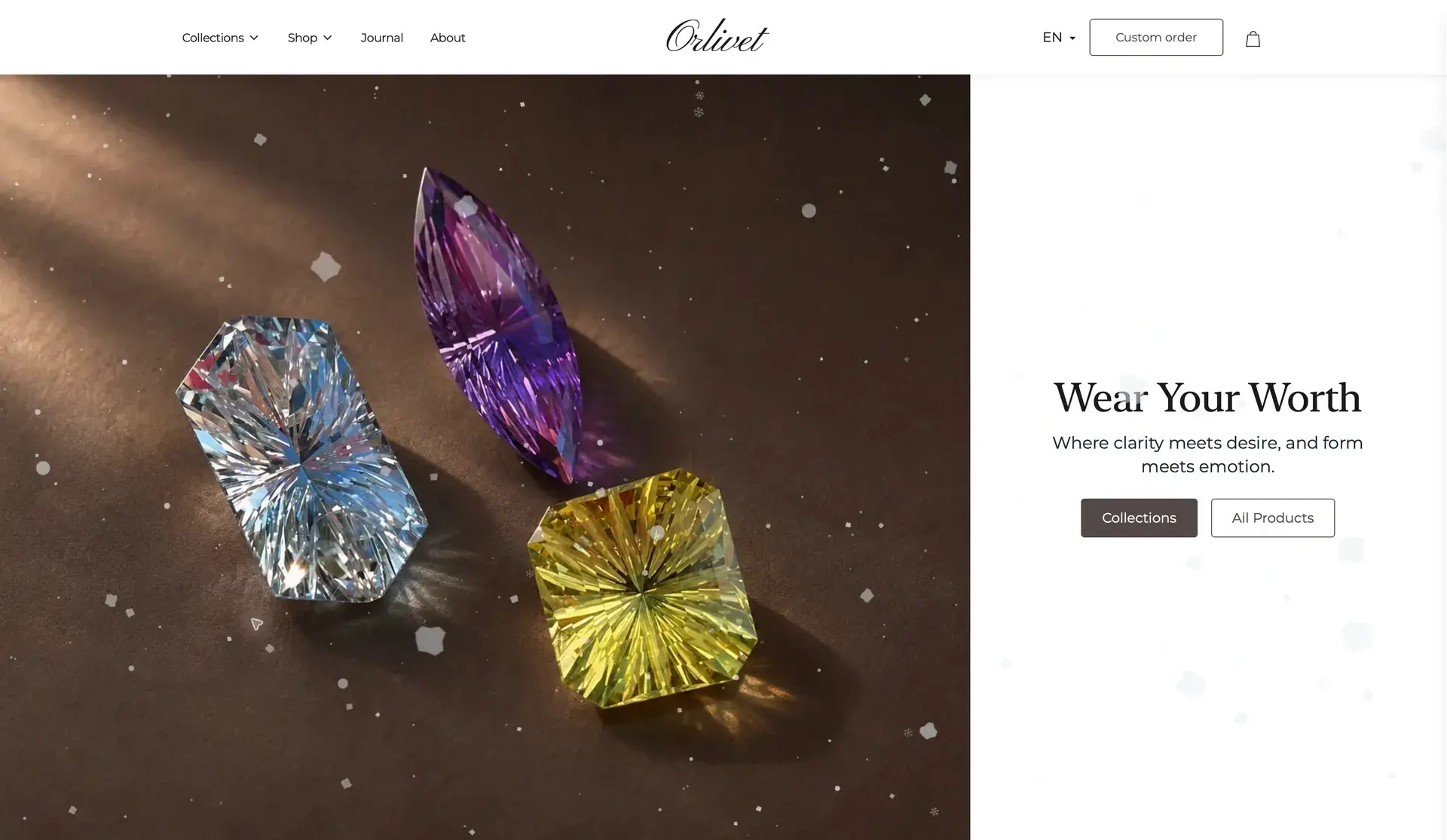
The opening composition and the collection system translate a fine jewelry identity into a usable storefront.
The challenge: sell considered purchases, not anonymous products
A premium jewelry purchase needs more than a product tile and a price. A visitor wants to understand the object: its proportions, material, appearance, provenance and the experience around the purchase. A loose gemstone also raises practical questions about size, treatment and the setting it might require.
I organized the website around three connected journeys:
- Discover the brand: an image-led opening and collection stories establish a recognizable visual language.
- Evaluate a specific piece: product pages bring photography, specifications, availability and purchasing actions together.
- Commission something personal: the Atelier provides a separate path for visitors who need a conversation rather than an immediate transaction.
These journeys share a visual system, but they do not force every customer into the same buying process.
A luxury visual system with room for the product
I used a restrained palette, generous spacing, expressive serif headlines and a centered wordmark to give the storefront an editorial character. Large product imagery carries the visual weight; navigation and calls to action remain deliberately quieter.
The opening composition pairs close-up gemstone photography with a concise brand message and two clear entry points. Collection sections extend that identity through consistent image proportions, simple labels and a predictable route into the catalog.
That balance matters for high-consideration products. The interface should establish confidence through clarity and consistency, not compete with the stone or overwhelm the visitor with promotional elements.
Product discovery built around meaningful differences
The catalog gives visitors a searchable, filterable route through the assortment. Product names, prices, categories and availability are presented consistently, making individual items easier to compare without flattening them into interchangeable commodities.
I connected category and collection navigation with reusable product layouts. This keeps the system practical as the assortment changes: a new stone can enter an existing content structure rather than require a manually designed page.
The important distinction is between beautiful browsing and useful discovery. ORLIVET needs both. Visitors can explore the visual collection, then move into the information required to choose a specific item.
From discovery to a specific stone
Search and filtering support exploration; the product page supports the individual purchase decision.
Product pages that answer the next question
I developed product-detail pages as the point where visual desire meets product understanding. Large photography and alternate views sit alongside the commercial essentials: price, availability, dimensions and purchase actions.
Further down, structured specifications explain the stone in greater depth. Weight, cut, shape, origin and treatment have a consistent place in the layout. Supporting video, product-specific questions and related products extend the page without burying the primary decision.
This is especially useful for one-of-a-kind stock. The visitor is evaluating a particular object, not an abstract product category. Clear media, specific descriptions and visible availability help the website support that more deliberate decision.
I also separated the purchase of a loose stone from the request to turn it into a bespoke piece. Product-context contact links carry the item into the inquiry journey, giving the conversation a useful starting point.
Product understanding beyond the first image
Structured specifications and supporting media explain the object before the visitor needs to ask.
Bespoke jewelry gets its own conversion journey
Custom jewelry is a different commercial conversation from buying an available stone. I gave it a dedicated Atelier experience instead of relying on a generic contact form.
The page introduces the service before asking for details. A guided sequence helps visitors describe their preferences, including the type of piece, metal, gemstone and budget. A direct request option remains available for people who already know what they want.
The structure turns an open-ended request into a clearer brief while retaining the personal character of a bespoke service. It gives the business a better starting point for the follow-up conversation, without asking the customer to understand the entire production process first.
A dedicated path for bespoke jewelry
Visitors can enter a guided design conversation or move directly to a private request.
Sanity Visual Editing: a store the team can maintain
I implemented Next.js, React and TypeScript for the website, with Sanity as the structured content system. The editorial architecture covers page sections, images, navigation, collections, product information and journal content.
Sanity's Presentation workflow connects editing with a visual preview. Editors can work with the content in context, inspect changes before publishing and update reusable sections without editing application code for routine content changes.
The practical benefit is independence. Replacing product photography, refining a collection description or publishing an article should be an editorial task, not a development ticket.
I kept product content structured so that specifications, descriptions and images remain usable across the catalog and detail pages. The same principle applies to the journal: editorial pages use a consistent framework rather than a new layout for every story.
Editorial depth and mobile continuity
Product education and responsive presentation remain part of the same brand system.
Performance and security have distinct technical jobs
The site uses server-rendered pages and a cached published-content layer. That puts the main content in the page response and avoids turning routine content updates into browser-side polling. Explicit image dimensions and asynchronous image decoding support more stable rendering around an image-heavy catalog.
The architecture also separates the public storefront from privileged operations. Sanity credentials and Stripe secret keys are read in server-side code. The Stripe webhook handler verifies incoming event signatures, and the form endpoint validates the form type and email before forwarding a request.
Optional analytics and embedded-media preferences are handled separately from essential shopping functionality. A visitor can decline optional cookies while continuing to browse the store.
These are specific engineering decisions, not visual badges. They give content delivery, editing, payment integration and privacy choices clear responsibilities within the system.
What I delivered
- A cohesive premium visual identity translated into a live, responsive storefront.
- Collection and category journeys connected to a searchable product catalog.
- Reusable product pages with photography, specifications, video and availability.
- Shopping-bag and Stripe checkout integration.
- A dedicated guided and direct inquiry journey for bespoke jewelry.
- Sanity content models and visual preview for ongoing website management.
- A journal that extends product education within the same brand system.
- Page metadata, structured content and internal navigation that support discoverability.
ORLIVET demonstrates how I connect brand presentation, commerce UX and content operations in one implementation. The delivered outcome is a working store that makes a distinctive product easier to discover, evaluate and manage online.
Visit ORLIVET, explore my website development services or discuss your eCommerce project.
Website screenshots captured from orlivet.com on 8 November 2026. Select a screenshot to inspect the interface in detail.