Before Black Friday and Cyber Monday, fix the point where buying intent breaks. More traffic cannot compensate for an unclear product page, a missing offer, a broken cart email or a checkout journey that changes without the team noticing.
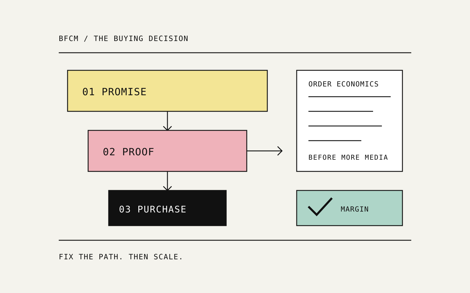
My BFCM conversion optimization plan starts with the promise made in the ad and ends with the contribution left after the order. Every step between those points needs a job.
The most useful conversion tests do not always require a redesign, a deeper discount or more advertising budget. They improve when and where shoppers receive the information needed to buy.
That is where I would start before increasing holiday spend.
Find the leak before choosing the test
I do not start a conversion review with a list of fashionable experiments. I start with the journey people are actually using, especially on a phone inside the app sending the traffic.
Which product did the ad promise? What appears after the click? Can the shopper understand the offer, choose a variation and see the delivery terms? If they leave, does the follow-up answer the reason they hesitated?
Use that review to choose the first problem:
| What the journey shows | What I investigate | First candidate test |
|---|---|---|
| Product-page visits without meaningful product interaction | Whether the first screen answers the ad's promise | Match the opening explanation to the traffic source |
| Shoppers repeatedly looking for sizing or setup information | Whether useful proof is buried | Move an existing educational image earlier |
| Subscribers opening welcome emails but not buying | Whether the promised benefit arrives too late | Present the existing offer in the first message |
| High-intent carts receiving weak follow-up | Timing, broken assets and unresolved objections | Repair the flow, then test one timing change |
| Higher conversion but weaker order economics | Discounts, product mix, shipping and returns | Review contribution before declaring a winner |
Fix defects before testing persuasion. A broken product image is not an interesting control condition. It is a broken product image.
Keep the ad promise alive after the click
A creator can sell a very specific reason to buy: an easier routine, a better fit, a practical gift or a product for a particular situation. A generic landing page can erase that reason in seconds.
The Marketing Operators funnel discussion compared how creator messaging, product explanation and the offer fit together. My takeaway is continuity: the next screen should develop the reason someone clicked, not make them start their research again.
For a bedding product, imagine an ad focused on fitting a deep mattress. The destination should make the verified fit information easy to find. Leading with unrelated lifestyle copy and asking the shopper to search for dimensions creates avoidable work.
My message map has four fields: the ad's promise, the shopper's main objection, the proof that answers it and the next action. Keep those aligned across the ad, product page, cart and follow-up.
A dedicated landing page is worthwhile when it serves a meaningful audience or message difference. I would not build one for every creator name without evidence that the buying question changes.
Move the answer earlier in the product gallery
DTC's 15 October CRO example proposed moving an existing three-step setup graphic from fourth to second in a product gallery. The test changed image order, not the design.
I like the commercial question behind that example: how far does the shopper have to swipe before the page answers the objection that matters?
For different products, that answer might be dimensions, included pieces, assembly, material, care or a clear comparison between variations. A polished room photograph cannot do every one of those jobs.
My test brief would keep the assets, price and offer unchanged, then compare the current order with one that presents the relevant explanation sooner. Review mobile traffic separately and follow purchase conversion and net revenue per visitor, not just gallery interaction or add-to-cart.
This is a low-production-cost test. Its strength is that the changed variable is clear enough to learn from.
Put useful proof next to the buying decision
Proof works best when it resolves an actual doubt. A review saying a product looks beautiful may not answer whether it fits, feels right or is straightforward to use.
The 19 October DTC edition highlighted a test placing a written review near the buy box. I would use that placement idea to test a specific objection, rather than borrowing another store's revenue projection.
Choose an authentic review that is relevant to the product and permitted for the intended use. Make it readable, attribute it clearly and keep the purchase control easy to find. On mobile, the proof should support the decision rather than push the essential controls out of reach.
The same discipline applies to AI-assisted creative. Improve the presentation without inventing product features, materials or testimonials. A convincing image that misrepresents the product is a conversion problem waiting to become a return problem.
Deliver the welcome offer when it is useful
In Pilothouse's Silk & Snow email teardown, a $10 welcome offer appeared in the third email, three days after signup. The proposed test moved that existing offer into the first message. The teardown also identified broken cart images, duplicate CTAs and a first cart reminder sent after two days; it proposed testing a reminder after 30-60 minutes.
Those are specific hypotheses, not a reason to redesign every flow. My starting question is whether the first message delivers the benefit the signup experience led the shopper to expect.
If the same offer already exists, test presenting it earlier without changing its value. Keep subject-line testing separate so you can distinguish the effect of opening the email from the effect of seeing the offer inside it.
I would measure the result across eligible subscribers: orders, net revenue, contribution and incentive use. More redemptions are not sufficient if the discount mainly reaches people who would have bought anyway.
Later messages can then do a different job: explain the product, answer category-specific questions and help the subscriber choose. Repeating the same discount is not a lifecycle strategy.
Recover the abandoned decision, not just the abandoned cart
The timing of a cart reminder is only one part of the recovery system. The message also needs to address why the shopper stopped.
A high-value purchase may need delivery clarity, dimensions, payment information or reassurance about what happens after ordering. A lower-consideration purchase may simply need a working route back to the selected product.
My sequence is to verify the flow first: correct product, correct variation, working images, accurate price, one clear CTA and a valid checkout destination. Then test timing on an eligible audience using the appropriate messaging permissions.
Use a control or holdout to evaluate additional orders. A recovery platform can attribute a purchase to an email even when the customer was already returning to buy. I want to know what the flow added, what the incentive cost and whether unsubscribes or complaints changed.
That is also why I review email, SMS and app reminders together. Several teams can each optimize their own recovery report while the customer receives an excessive combined sequence.
Check where the ad click actually goes
The destination is part of the experiment, even when the creative stays identical.
An ad click may open a website, a product detail page, a marketplace or an in-app shopping experience. Those paths can expose different products, recommendations and checkout steps. If the destination changes, the creative test has changed too.
Before peak traffic, I would record the live destination and catalog settings for important ads, including recently duplicated versions. Review the actual experience on the relevant device rather than trusting the destination URL alone.
Evaluate paths using comparable order and contribution measures. Website revenue per session describes the website path; it cannot by itself judge purchases completed on another surface. Keep each denominator attached to the journey it measures.
My rule is simple: do not call something a better ad until you understand the buying experience behind it.
Judge the winner by contribution, not conversion alone
Here is an illustrative calculation using the same 10,000 eligible sessions in each version. It shows why an order-rate increase is not automatically a better commercial outcome.
| Metric | Current offer | Deeper-discount version |
|---|---|---|
| Eligible sessions | 10,000 | 10,000 |
| Purchase conversion | 2.0% | 2.4% |
| Orders | 200 | 240 |
| Net sales per order | $80 | $68 |
| Net revenue | $16,000 | $16,320 |
| Variable costs per order, excluding media | $50 | $50 |
| Contribution before media | $6,000 | $4,320 |
| Contribution per session before media | $0.60 | $0.432 |
Orders rose 20%. Revenue rose 2%. Contribution before media fell 28%.
For this model, net sales already reflect the discount and variable costs include the chosen fulfillment, payment, product and expected-return allowances. Compare media costs separately and consistently. The figures illustrate the decision logic; the live calculation should use the business's actual cost definitions.
This is why I use contribution per eligible session for onsite offer decisions alongside purchase conversion, order value and refund behavior. For lifecycle tests, use the eligible customer or recipient as the denominator. For acquisition, add media and creator costs.
If a creator sale carries both commission and paid amplification, both belong in the calculation. An inexpensive-looking source can become expensive when the second cost layer is left out.
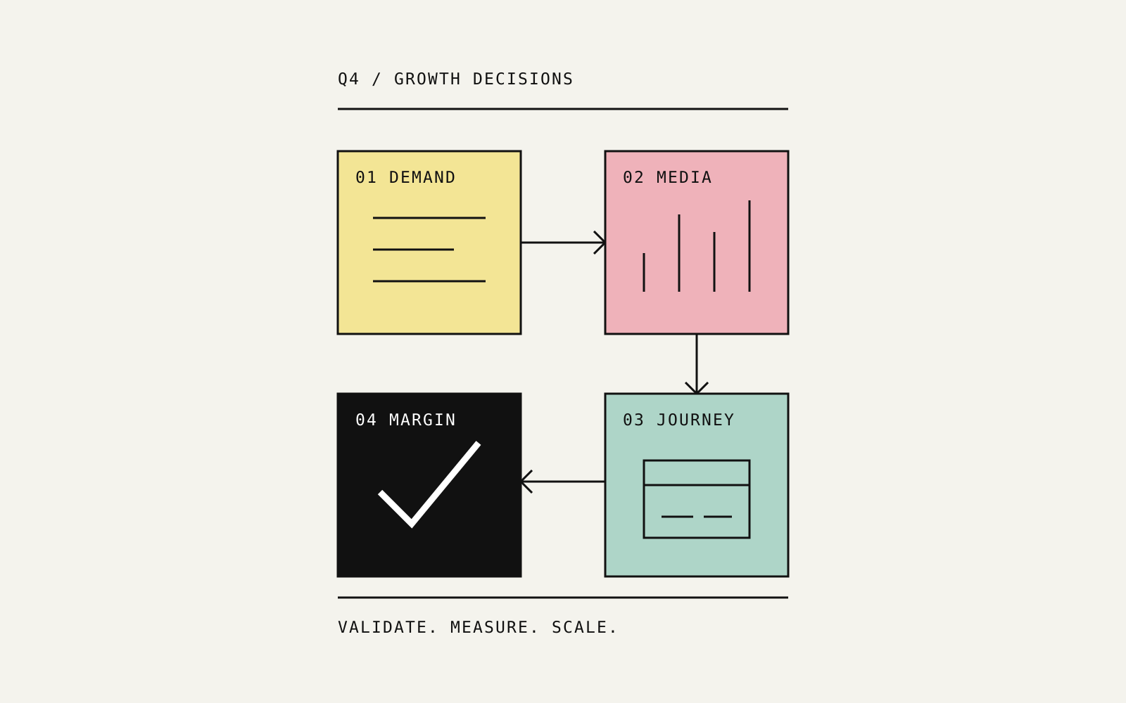
My Q4 offer framework adds the inventory and fulfillment checks that should sit beside this calculation.
Run one commercially meaningful test at a time
When an offer, audience, destination and email schedule all change together, the team gets a result but loses the explanation.
I would write the following brief before launching a pre-BFCM test:
| Decision field | What the team writes down |
|---|---|
| Problem | The observed point of friction, not a generic desire to improve conversion |
| Hypothesis | Why this particular change should help the shopper decide |
| Audience | Eligible traffic or recipients, with exclusions stated |
| Control | The current experience retained for comparison |
| Primary measure | Contribution per session or recipient, matched to the test |
| Guardrails | Refunds, delivery capacity, unsubscribes and critical UX failures |
| Review rule | A planned sample and observation window suited to conversion volume and purchase lag |
Choose a test the available traffic can support. If the purchase volume is too low to distinguish outcomes credibly, fix known defects and collect better diagnostic evidence instead of manufacturing a winner from an early fluctuation.
The same approach applies to advertising automation. My Amazon PPC decision-system article explains how to turn reporting into a controlled review process rather than a stream of automatic changes.
My pre-BFCM execution order
First, remove defects that prevent an intended purchase: incorrect prices, broken images, missing variations, failed codes and bad checkout links. Those need repair, not an A/B test.
Next, make the existing value easier to understand. Bring the relevant explanation and proof closer to the decision. Deliver the promised welcome benefit clearly. Review the complete mobile reminder experience.
Then run the highest-priority experiment with a stable comparison. Expand traffic only when the destination works and the order economics justify it. For the second purchase, give the customer a useful reason to return rather than assuming another discount will be enough.
That is the growth work I consider worth paying for: identify the actual constraint, make a precise change and show whether the business benefited.
Explore my conversion optimization consulting, paid media work and growth strategy, or discuss the weakest point in your funnel.
BFCM conversion optimization FAQ
What should an ecommerce brand fix before increasing BFCM ad spend?
Check the actual mobile buying journey, product availability, offer clarity, checkout and lifecycle follow-up. Repair known defects first, then test the change tied to the clearest commercial bottleneck.
Should the welcome discount appear in the first email?
If the signup experience promises an offer, the first message should deliver it clearly. For an existing sequence, test timing without changing discount value and measure additional orders and contribution across eligible subscribers.
How quickly should an abandoned-cart email be sent?
There is no single best delay for every product. Compare timing against purchase consideration, audience behavior and the existing reminder sequence. Evaluate incremental orders, contribution and unsubscribes rather than recovered revenue alone.
Which metric should decide whether a conversion test wins?
For an onsite ecommerce test, contribution per eligible session connects conversion with order economics. Review it with purchase conversion, order value and returns. Use a recipient or customer denominator for lifecycle experiments.
Source notes
- Welcome and cart recovery: DTC1181 / Pilothouse's Silk & Snow teardown, 16 October.
- Product-gallery sequence: DTC1180, 15 October, including the existing educational-image test.
- Buying-surface changes and review placement: DTC1182, 19 October.
- Creator and landing-page continuity: Marketing Operators E133, 13 October.
- Worked economics: the 10,000-session comparison is an illustrative model developed for this article. The prioritization and measurement framework are my analysis.